Pages

Wednesday 24 September 2014

Spring

Here are some progress photos on a spring quilt I've been working on.


I can't show more photos before it's published, but it's in purples and greens, and uses the lovely scallop print from Tula Pink's Parisville. It's come almost entirely from my stash, including the white-on-white snowflake I used for the background.

I dithered for ages about whether to make it scrappy or not and went for scrappy. I'm not sure why, because scrappy isn't really my style. I do like the finished quilt top, but I think I'd've loved it if I'd stuck with my instincts!


There's applique as well as piecing, and it's more of the plume shape which has shown up in quite a lot of my recent quilts. And the quilting matches the applique.

Tuesday 23 September 2014

Louise

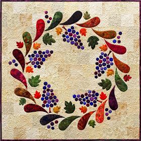
Louise is in the current, 20th Anniversary, edition of Australian Patchwork & Quilting (Vol 24 No 2), and is one of my favourites:


It was rather appropriately inspired by a lovely weekend Simon and I spent here in the Barossa Valley for our wedding anniversary last year, but I chose the name because it's also my middle name. We were there in early summer, but I chose these lovely autumnal colours which make me think more of sitting in front of a roaring fire!


I started the quilt with a selection of creamy text and map prints, augmented by some tone-on-tones - including, of course, a snowflake print! Perhaps I should make it my aim to include something snowflakey in every quilt...


Then I added the applique pieces, including about 130 of the grapes. Thankfully my planned applique technique was quick! But when I pinned the top up it became clear that the orange plume towards the upper left was far too bright, Fortunately I hadn't fused them properly at that stage, just enough to hold, and was able to heat the offending piece and peel it off to replace it with something more fitting.


The applique was done after sandwiching,a double line of free-motion quilting in matching coloured thread right at the edge of the applique. To save my sanity I used the same variegated purple for all the grapes.


The background is filled with dense quilting that took ages, but I love it I'd been wanting to try it for a while; it's a random combination of swirls, clamshells, pebbles and 'c's. It's a wonderfully flexible design to fit around all the odd shapes, and the only challenge is keeping it balanced. I'll definitely be using it again, although it's not something for huge spaces.


The instructions and pattern are in the current issue of AP&Q if you'd like to make your own version.

Monday 22 September 2014

Grand Coeur

I'm going to try and ease myself back into regular blogging by sharing the two quilts which have been published since I vanished from here. In that time we've had a fabulous family week at the snow - the highlight of which was probably tracking myself skiing at just over 115 kilometres an hour! I've also been busy with work, meeting some other publishing deadlines, and writing a dozen or more blog posts in my head!


This is Grand Coeur.


It's actually named after one of the ski runs at Falls Creek, where we were skiing a few weeks ago. I chose the name because the grey background print and the red print look snowflakey to me, and it means 'Big Heart' in French.


It's made entirely from a fairly new fabric range called Primrose Sands by Australian designer Helen Stubbings. I was honoured to be asked to design a quilt to feature the fabrics. I actually ended up using a limited selection of the range for my baby-size applique quilt (it's about 40in square).


The hearts were layered from three different fabrics and I had fun showcasing the stripe in an unusual way - and of course I couldn't resist using the stripe for the binding as well! But to add more definition to the edge of the quilt, the binding has faux piping (that red strip is actually part of the binding!).


I used quite a few different quilting designs which came about more by accident than design - but looking at the whole quilt, I think it works perfectly. The feathers in the centre were chosen because I was tired of the swirls, but now I love the contrast, and feel they wouldn't show to such effect if the background quilting were matching feathers.


The hearts were quilted along the lines of the fabric print. There really wasn't any other option. They needed quilting densely - the comparison photo above shows how puffy the one on the left was before quilting - and I couldn't bring myself to detract from my favourite print by quilting something else all over it. Luckily the print lent itself well to quilting along the design, although it was quite fiddly - the closer photos above show the actual stitching better.

The pattern for Grand Coeur is in Australian Patchwork & Quilting Vol 24 No 1. It was the August issue, so in Australia, you'll need to check via here for back issues.